


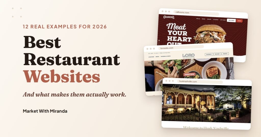
Your food might be incredible. Your ambiance might be perfect. But if someone finds your website and leaves confused, you’ve already lost them.
Studies consistently show that around 77% of diners visit a restaurant’s website before deciding where to eat. That means before a single plate hits a table, your website is already making a case for or against you.
So what does a great restaurant website actually look like in 2026? I pulled together twelve real examples, the majority built on WordPress, and broke down exactly what makes each one worth paying attention to.
What Do the Best Restaurant Websites Have in Common?
Before we get into the examples, it helps to understand the standard worth measuring against.
A great restaurant website does a small number of things well:
It makes the menu easy to find. It shows the food in a way that makes people hungry. It tells you where to go and how to get there. It gives someone a clear way to book a table or place an order. And it feels like the restaurant before you ever walk through the door.
That last part is the one most restaurants miss. Design consistency, the way the typography, colors, and photography all feel like they belong together, is what separates a website that converts from one that just exists.
12 Restaurant Website Examples Worth Stealing From
1. Tacos My Guey — tacosmyguey.com

Platform: WordPress + Elementor
Type: Multi-location fast casual, Orlando FL
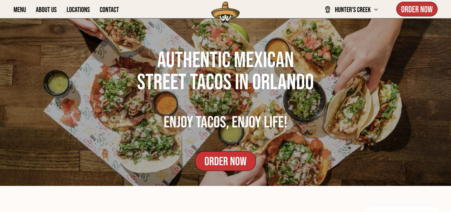
Tacos My Guey runs five locations across Orlando, and their website handles that complexity without feeling cluttered. The menu, the location finder, and online ordering are all easy to find from the first screen. Food photography feels real rather than overly styled, and the warm, punchy color palette (reds, yellows, and greens) does the work of communicating the vibe before a single word registers.
What this site does well is personality at scale. A lot of multi-location restaurants start to feel generic as they grow. This one keeps its street taco energy intact. Catering is clearly signposted for anyone looking to book, and the franchise page is there for an entirely different visitor without cluttering the main experience.
The lesson: If you have multiple locations or service options, make sure each one is clearly findable without burying the most important conversion path. Online ordering and the menu should always be one click away.
2. Just Falafel Vegan Cafe — jfvegancafe.com

Platform: WordPress + Elementor
Type: Plant-based cafe, Houston TX
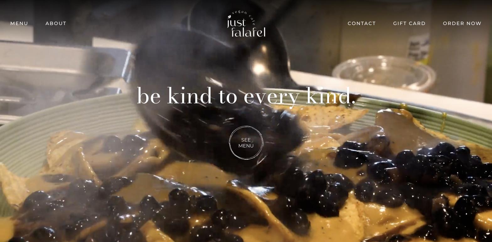
This is a tight, well-branded single-location site. The script logo is distinctive. The homepage copy, “be kind to every kind,” earns its place immediately. The layout moves from hero to menu to contact without wasted steps, and it loads quickly.
What I notice about this site is how much the brand identity carries it. A full-screen food video, a memorable logo, and copy that communicates the mission in five words. The design doesn’t try to do too much, and that restraint is actually the strength.
The lesson: For a single-location restaurant with a strong mission or identity, lean into it fully. A focused site with a clear point of view will outperform a busy site trying to appeal to everyone.
3. Peg Leg Porker — peglegporker.com
Platform: WordPress (custom theme)
Type: Family-owned BBQ joint, Nashville TN
Peg Leg Porker has been in the Gulch since 2013. Pitmaster Carey Bringle has cooked at the James Beard House twice, built an award-winning bourbon, and earned a reputation as one of the South’s best. The site has to serve that full picture, and it does.
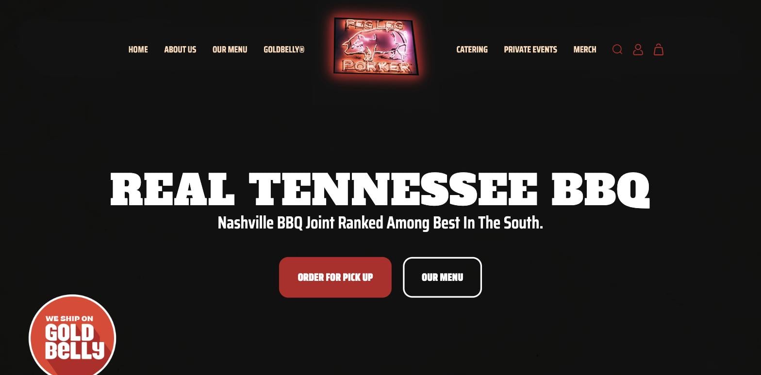
What this site gets right is showing the whole business without making it feel complicated. The navigation makes three distinct revenue streams immediately findable: dine-in (the menu and pickup ordering), catering, and private events. Each has its own section and its own clear path. The Pitmaster story lives right on the homepage, not buried in an about page, which positions the brand immediately around the person behind it.
The hero is direct: “Real Tennessee BBQ.” One line. The order button is there before you have to look for it. Address and phone number live in the footer on every page. That’s the whole job done.
The lesson: Even a single-location restaurant can have multiple revenue streams, and each one deserves a clear path from the front door. If you offer catering, private dining, or merchandise alongside your main business, your navigation should treat those as equals, not afterthoughts buried in a dropdown.
4. Akaneya Japan — akaneyajapan.com
Platform: WordPress (custom theme)
Type: Luxury sumibiyaki restaurant, Barcelona / Madrid / Paris
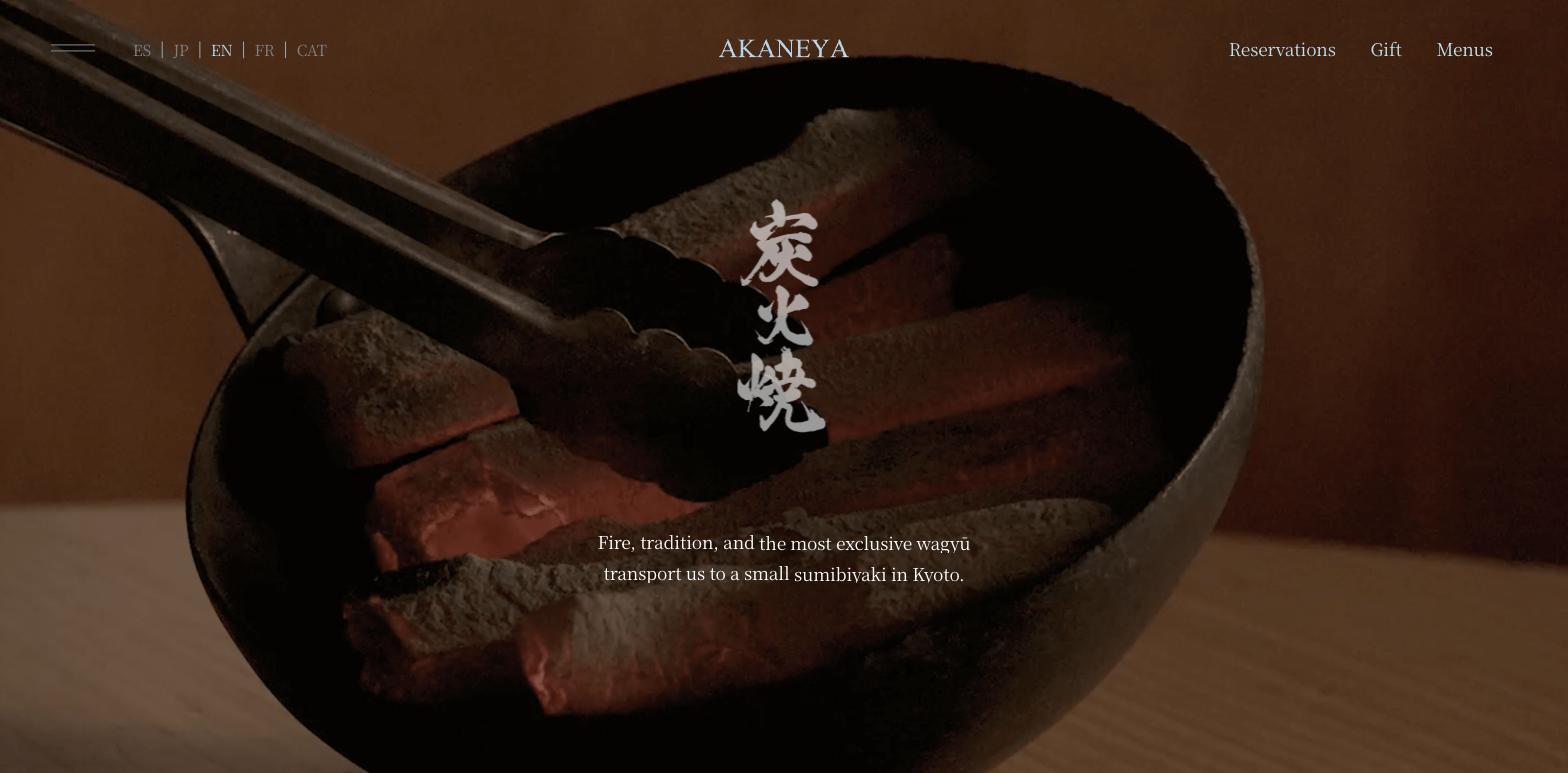
This one is for anyone wondering how much a website can communicate before a visitor reads a single word. Akaneya serves wagyu over charcoal across three European cities, and the site feels like that before you click anything. White space, fire imagery, a quietly confident navigation structure, and a language switcher that handles five languages without making the international presence feel awkward.
The brand story, fire, tradition, precision, gets communicated through the design choices themselves. The reservation flow is front and center. The multi-city presence is handled cleanly without turning the homepage into a map.
The lesson: The visual choices on your website are doing the selling before the copy kicks in. If your restaurant has a strong concept or elevated positioning, your site should reflect that in typography, whitespace, and imagery long before someone reads your about page.
5. Galvin Restaurants — galvinrestaurants.com
Platform: WordPress (custom theme)
Type: Fine dining restaurant group, London + Essex
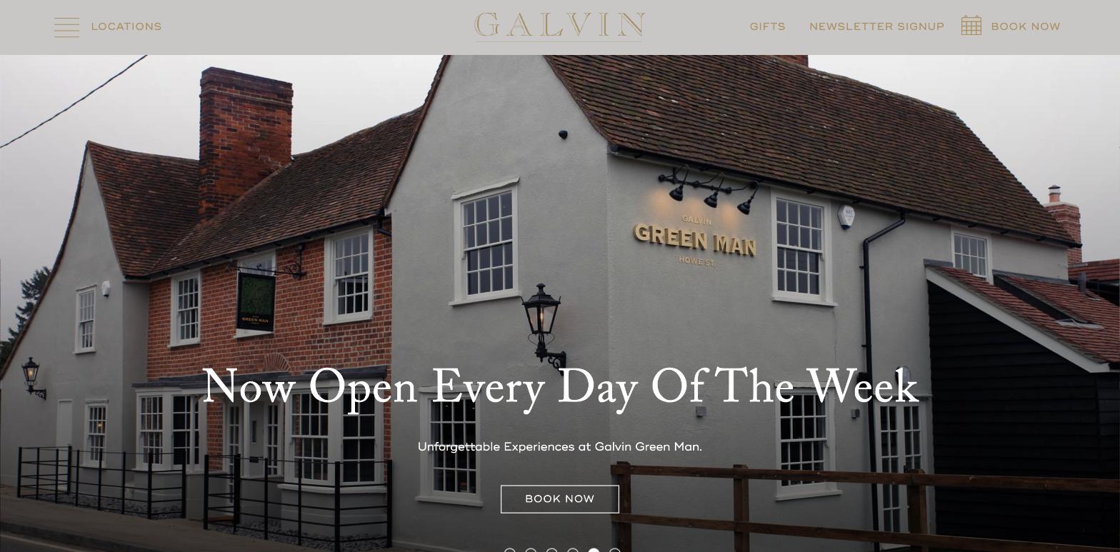
The Galvin brothers have three Michelin-starred restaurants across London and Essex, and their site handles multi-venue branding in a way that most restaurant groups get wrong. Each venue has its own page and booking flow, but the overarching design keeps the family-run identity intact throughout.
The gold accent color on a deep ash background signals fine dining without saying it explicitly. Serif display fonts, clean editorial photography, and a navigation structure that surfaces every venue, private dining, and gift vouchers without overwhelming the homepage.
The lesson: If you run more than one location or concept under one brand, the website architecture matters as much as the design. You need a clear hierarchy that lets someone find their specific destination without making them wade through everything else.
6. Husk Nashville — husknashville.com
Platform: WordPress (custom theme)
Type: Farm-to-table Southern, Nashville TN
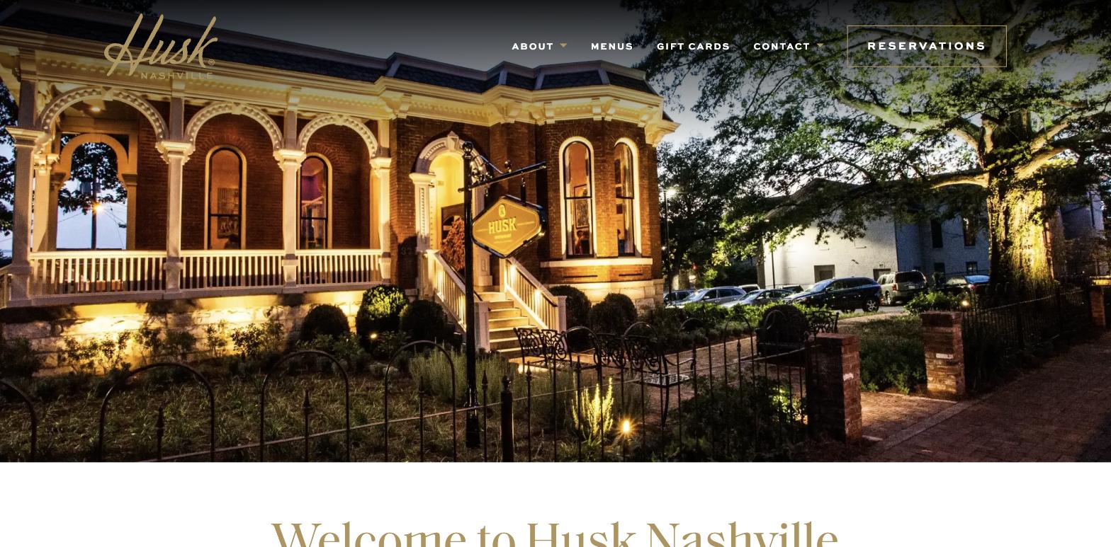
Yes, there is a Tennessee example on this list, and it’s a good one. Husk Nashville is part of The Neighborhood Dining Group and sits in a historic Victorian mansion in Rutledge Hill, just south of downtown. The website matches that heritage without feeling fussy.
The design is clean and restrained. A single hero image sets the tone. Navigation goes straight to menus, about, and reservations without unnecessary stops along the way. What this site does particularly well is its purveyors section, which spotlights the Tennessee farms and producers behind the ingredients with their own logo marks and locations. It’s a storytelling choice that builds trust and signals the restaurant’s values before you read a single menu item.
The menu itself is served as a PDF rather than a styled web page, which is a tradeoff. It keeps the kitchen’s daily updates simple, but it’s not ideal for mobile. Worth noting if you’re building something similar.
The lesson: Showing your sourcing and your relationships with producers is a powerful trust signal, especially for ingredient-driven restaurants. It also gives you genuine, specific content that search engines can use, without having to invent something.
7. Loro — loroeats.com
Platform: WordPress (custom theme)
Type: Asian smokehouse, multiple Texas locations
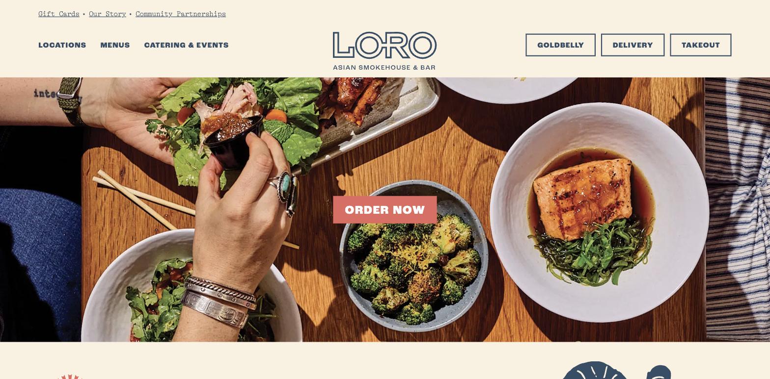
Loro is the collaboration between the teams behind Franklin Barbecue and Uchi, and the website leads with that energy. A custom illustrated style runs throughout the site, giving it a look you could not mistake for anyone else. The tagline does the work fast: “smoked meats, boozy slushees, rad veggies, chill vibes.” Eight words and you know exactly what this is.
What stands out technically is how Loro handles multi-location complexity. Each location, across Austin, Dallas, and Houston, has its own dedicated section with hours, menus, and links, but the brand identity stays completely coherent across all of them. The cream and dark navy palette carries from page to page without variation. Online ordering is front and center on every location view.
The illustrated art direction is worth paying special attention to. Custom illustration is often dismissed as expensive or unnecessary, but it immediately differentiates a site from anything template-based. For a restaurant with a concept this specific, it earns its place.
The lesson: If your restaurant has a genuinely distinctive personality, invest in one design element that makes that undeniable. For Loro it’s the illustration. For you it might be a custom logotype, a specific texture, or a signature color. One committed creative choice goes further than polished-but-generic across the board.
8. Bavel DTLA — baveldtla.com
Platform: WordPress (custom theme)
Type: Middle Eastern, Los Angeles CA
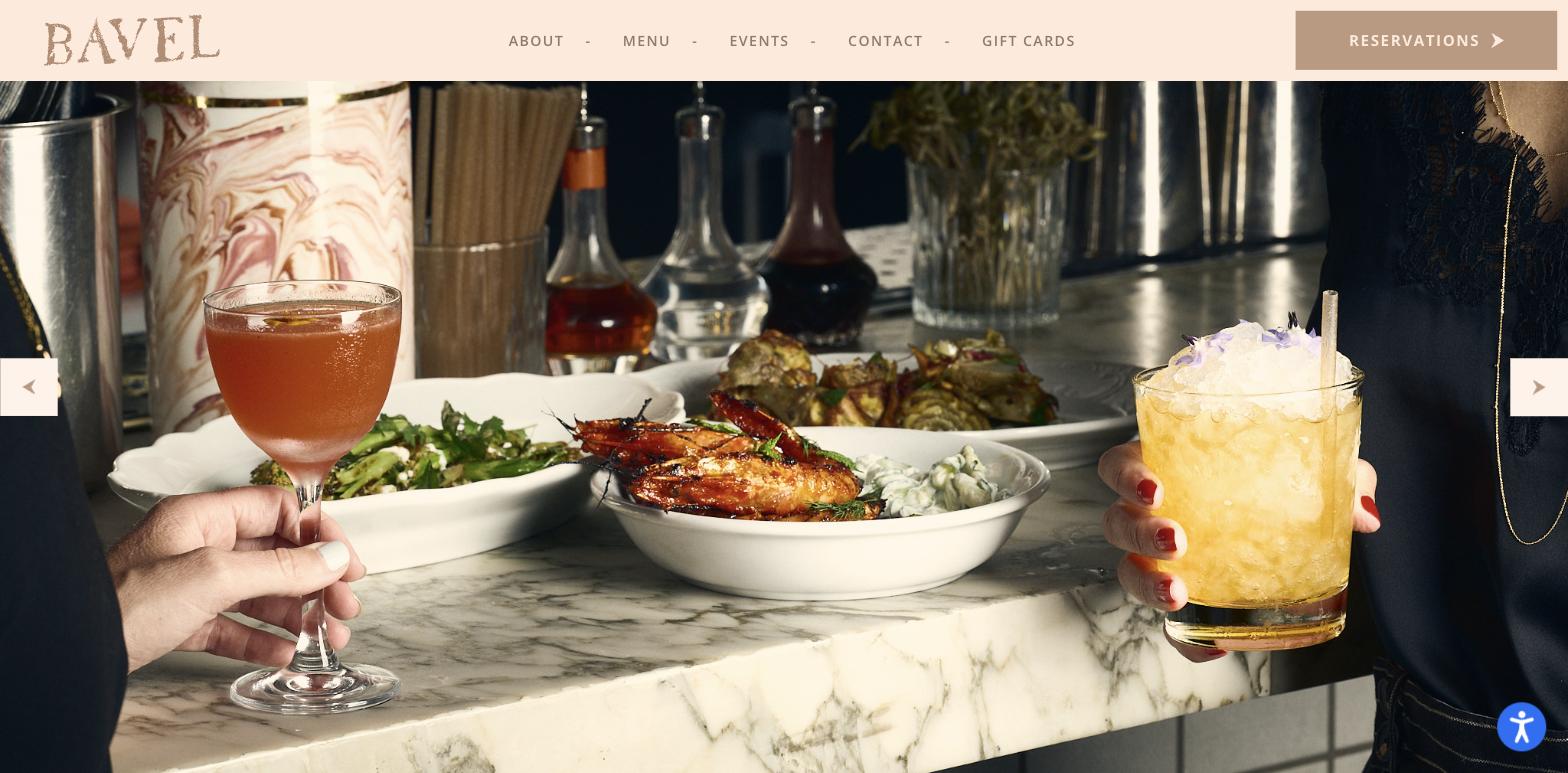
Bavel is a Middle Eastern restaurant from chefs Ori Menashe and Genevieve Gergis in LA’s Arts District, and it was named the LA Times Restaurant of the Year in 2019. The website still carries that pedigree in how it’s put together.
The palette is warm and organic: a soft blush background, photography that’s rich and saturated without being heavily filtered. The navigation is minimal (About, Menu, Events, Contact, and Gift Cards, with Reservations set apart as a button) and the homepage does not try to compete with the food photography. It’s all restraint and atmosphere. You feel like you’re being shown something rather than sold something.
This is a custom WordPress build, and the performance reflects that. No page builder overhead, clean layout, fast load. It’s a good illustration of what’s possible when WordPress is built for a specific restaurant rather than adapted from a template.
The lesson: The best fine dining websites feel like they exist to serve the food and the guest, not the designer. Keep navigation short, let photography breathe, and resist the urge to fill every section of the page.
9. Attack of the Tatsu — attackofthetatsu.com
Platform: Squarespace
Type: Japanese izakaya and ramen, Chattanooga TN
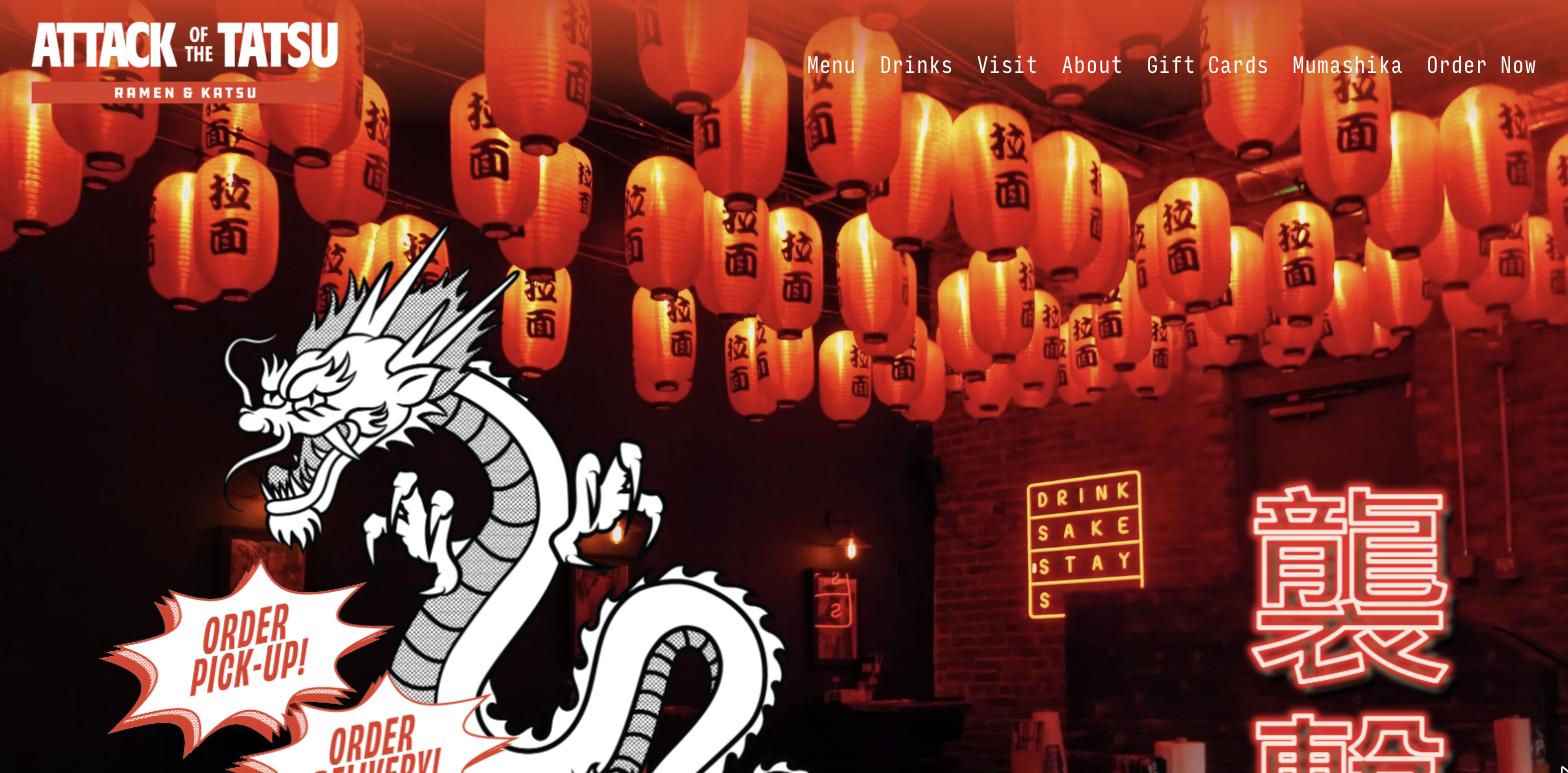
This one is personal to me — it’s a Chattanooga restaurant, and it’s one of the more confident, personality-driven sites in the Tennessee dining scene. Attack of the Tatsu is an izakaya and ramen shop on Georgia Avenue, and the website leads with animated GIFs: a dragon, a sake cup, a surfer. The dark background and red accents pull the whole thing together. Before you read a single word, you understand what kind of place this is.
The navigation is clean (Menu, Drinks, Visit, About), the ordering paths are clear (Square for pickup, DoorDash for delivery), and the hours — daily 11AM to midnight — are front and center for a late-night crowd who needs that information fast. An embedded Instagram feed keeps the homepage current without requiring content updates.
One honest note: the homepage meta description is empty. There’s no crawlable Chattanooga-specific copy in the body content. For an independent restaurant competing in local search, those gaps cost real visibility.
The lesson: A strong visual identity can make even a simple Squarespace build feel memorable and brand-right. But personality alone doesn’t rank. If you want Google to know where you are and what you serve, that information has to live in crawlable body copy, not just in images and a GIF.
10. Stock & Barrel — thestockandbarrel.com
Platform: WordPress (custom theme)
Type: Burger and bourbon joint, Knoxville TN
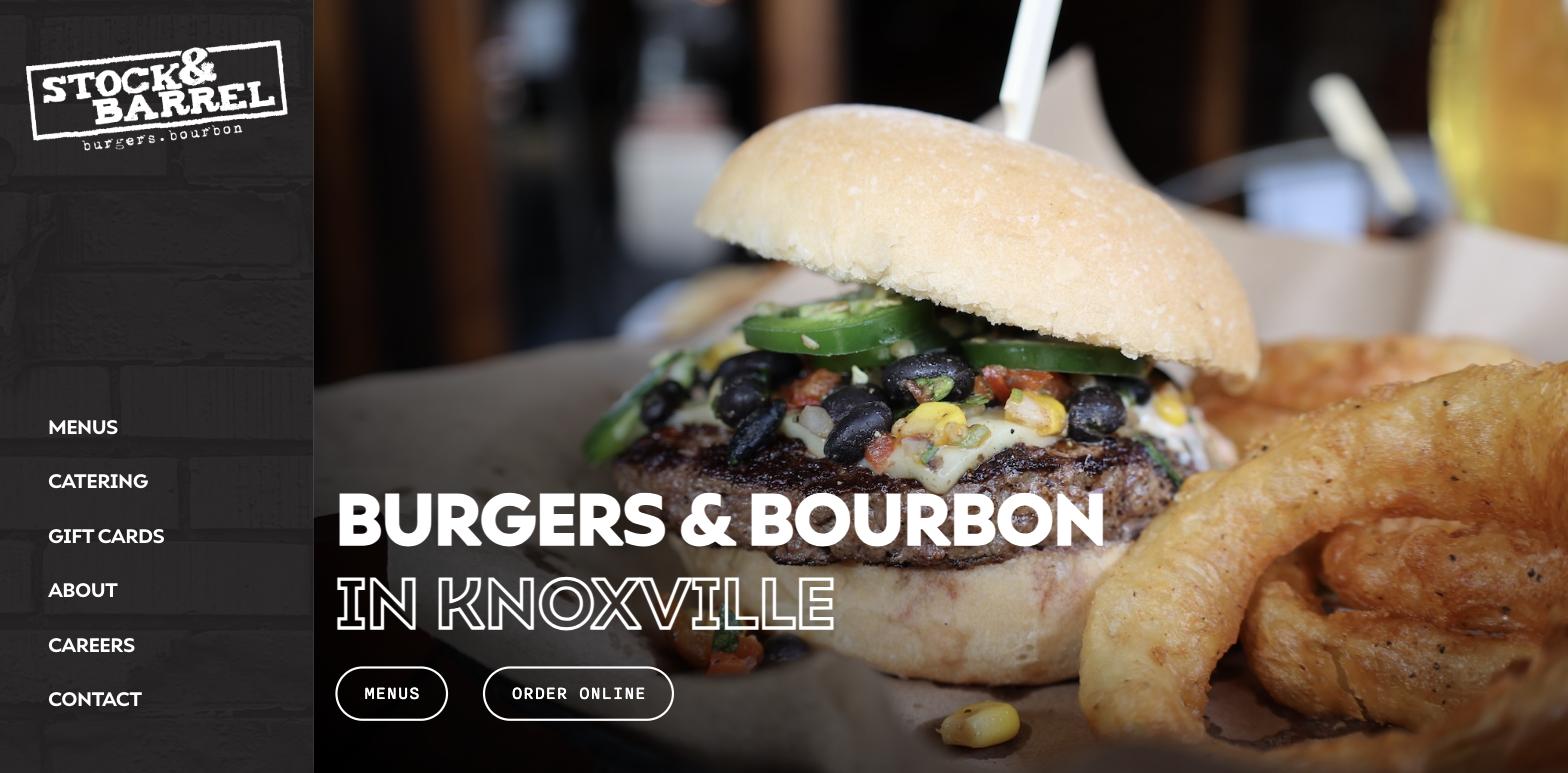
Stock & Barrel has been on Market Square in Knoxville since 2013, and the website does exactly what a burger-and-bourbon joint on a historic square should do: it opens with a video reel and gets to the point. “Burgers & Bourbon in Knoxville” is the headline. That’s not an accident. That’s a search-intentional phrase sitting in the most visible real estate on the page.
The copy that follows is equally deliberate: “consistently voted the best burger in Knoxville” repeated across sections, paired with mentions of their 300+ bourbon selection, Pappy Van Winkle, and Blanton’s. This site knows what people are searching for when they want upscale bar food in Tennessee, and it writes to that directly.
The Instagram feed embedded toward the bottom keeps the homepage fresh and shows what the food and atmosphere actually look like on a given week. Order Online and Catering both have clear paths. The video hero might be the one performance tradeoff worth monitoring — autoplay video adds page weight — but the content signals are strong enough to earn the investment.
The lesson: Your homepage headline is SEO copy too. If you’re known for something specific in your city, say it plainly in the first line rather than hiding it in an About page no one reads.
11. Calhoun’s — calhouns.com
Platform: WordPress (custom theme)
Type: Multi-location casual dining, 9 Tennessee locations
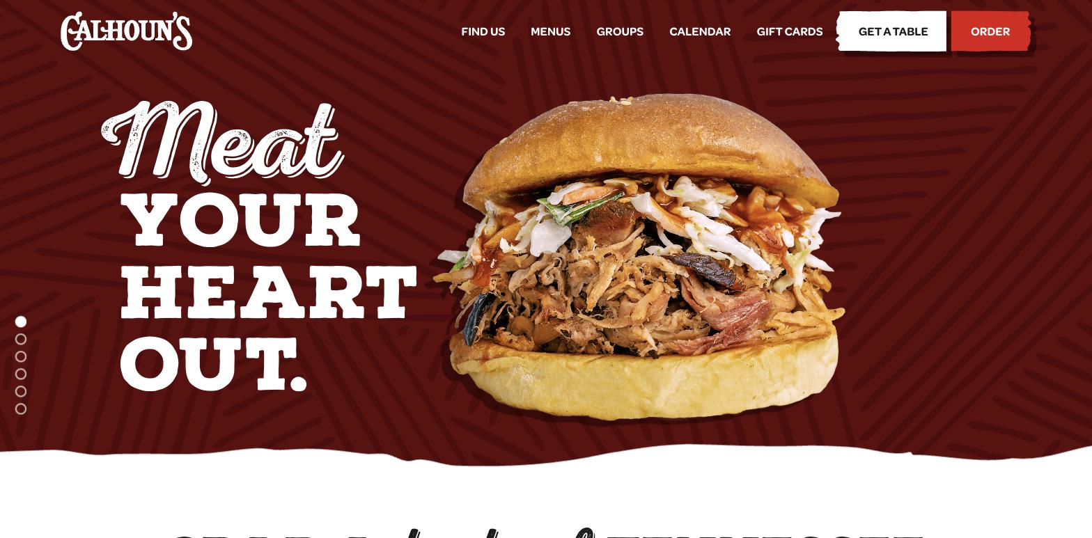
Calhoun’s is part of the Copper Cellar restaurant group and runs nine locations across East Tennessee, from Knoxville to Gatlinburg to Pigeon Forge. The WordPress site handles that scale without breaking a sweat.
The homepage copy is punchy and fun: “Meat your heart out,” “Every day is Fry day,” “Life is Brew tiful.” It cycles through food categories with matching photography, which does the job of communicating the full menu range quickly. Below that, the grid is organized around practical entry points: Feed Packs for families, online ordering, private group events.
The navigation is doing real work here. A Calendar section with dropdown links to Burger Day, Wine Night, Happy Hour, Trivia, Singo, Live Music, and Vol Calls communicates that this is a restaurant with a weekly rhythm, not just a place that serves food. Keeping that many recurring events current across nine locations is exactly the kind of job WordPress handles well. WordPress gives Calhoun’s the content infrastructure to run what is functionally a media operation for their dining brand.
The lesson: When your restaurant has regular events, specials, multiple locations, and multiple ordering paths, your website becomes content infrastructure. That’s a WordPress job, not a Squarespace job. Build for what you’ll need at scale, not just what you need to launch.
12. Puckett’s Restaurant — puckettsrestaurant.com
Platform: Squarespace
Type: Southern BBQ and live music, six Tennessee locations
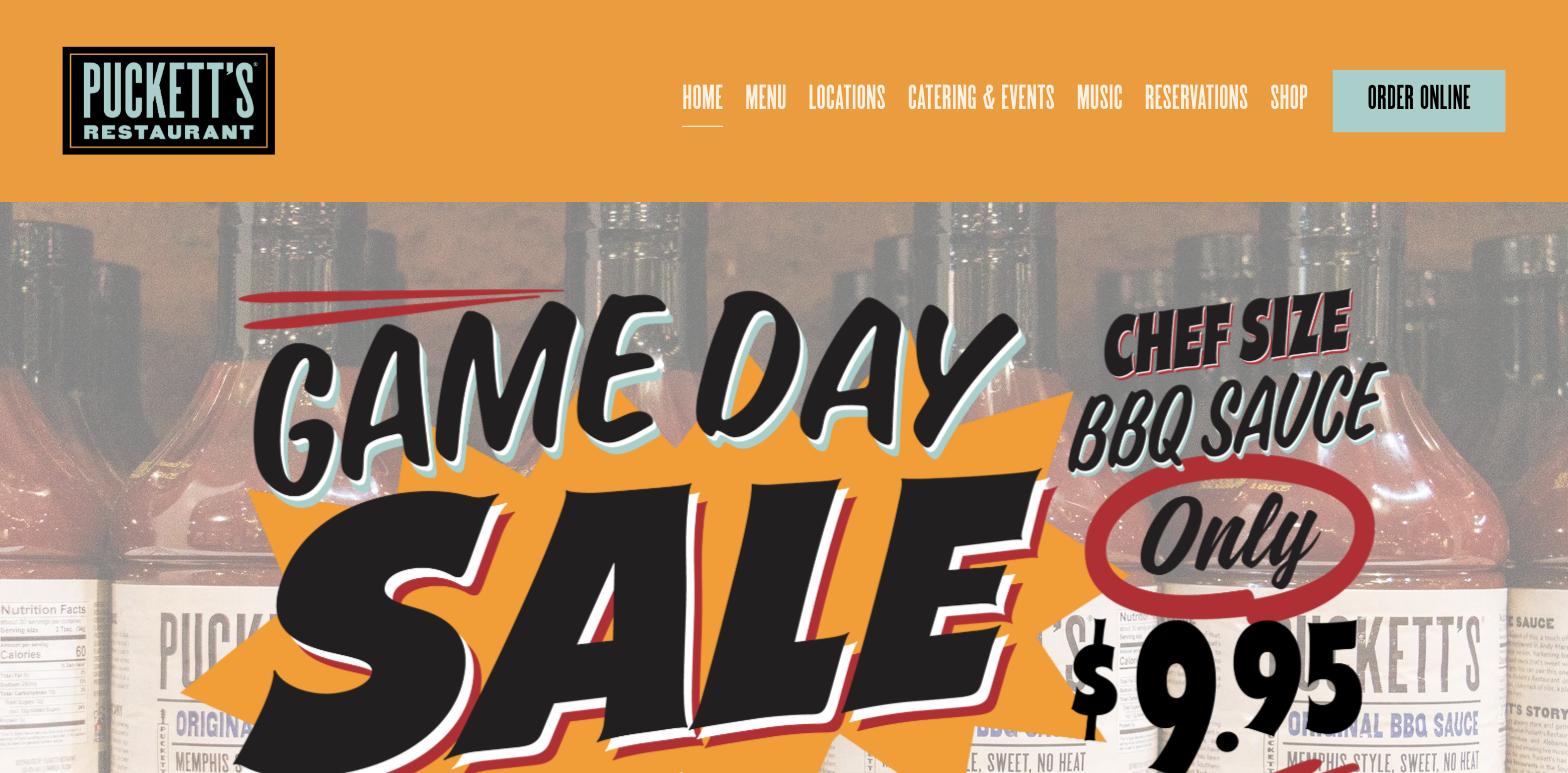
Puckett’s is a Tennessee institution. The original location was a small-town grocery store in Leiper’s Fork before it became one of Nashville’s most beloved BBQ and live music spots, and it now spans six locations across Tennessee.
The Squarespace site reflects the brand well — clean, warm, Southern without being kitschy. The menu, locations, and reservations are easy to find, and the live music angle gives Puckett’s something to talk about that most BBQ restaurants don’t. At this level of name recognition and institutional reputation, Squarespace’s simplicity is an asset rather than a limitation.
What’s worth noticing: live music gets its own spot in the main navigation. The Music menu leads to a Live Music page with a calendar for each location, so someone deciding which Puckett’s to visit can see who’s playing before they get in the car. For a restaurant where the music is part of the draw, that’s exactly where it belongs.
The lesson: If live events or programming are part of your brand, give them a permanent home in your navigation. A calendar someone can check before they head out turns “maybe this weekend” into a table for four.
Why Are These All (Mostly) Built on WordPress?
Of the twelve examples above, ten are built on WordPress and two are on Squarespace. Several of the WordPress sites use custom themes built by agencies, two are confirmed Elementor builds, and the rest don’t expose a builder at all.
The WordPress-heavy list isn’t cherry-picked. It reflects something real about which platform gives restaurants more long-term room to grow.
WordPress gives restaurant owners full control over content, integrates with virtually every reservation and ordering system on the market, and performs well in search when it’s built thoughtfully. Squarespace is faster to launch and easier to manage, and there are strong examples in this list to back that up. But the ceiling is lower. Schema markup, local SEO, custom integrations, and long-term content strategy all live more naturally on WordPress.
The builder question: Elementor vs. Kadence Blocks
Once you’ve committed to WordPress, you have a second decision to make: what do you build it with?
The two Elementor examples in this post, Tacos My Guey and Just Falafel Vegan Cafe, are easy to spot because Elementor writes a meta generator tag directly into the page source code. That’s one reason they show up in lists like this. It’s also a useful illustration of how Elementor works: it runs as a separate layer on top of WordPress, with its own interface and its own code output.
Most of the other WordPress sites in this list, Peg Leg Porker, Husk Nashville, Loro, Bavel, Galvin Restaurants, were built by agencies using custom themes. None of them broadcast which builder they used, because they don’t use one. They’re hand-coded or built with tools that don’t leave a signature.
That second group tends to be faster, and the reason is straightforward. Elementor loads a significant amount of JavaScript and CSS on every page, regardless of which features you’re actually using. A restaurant homepage doesn’t need most of it. The weight slows the page down, and Core Web Vitals scores reflect that.
This is where Kadence Blocks earns its place. Kadence works natively inside the WordPress block editor rather than wrapping a separate builder around it. It only loads the CSS and JavaScript for the blocks actually present on the page, nothing else. The result is pages that behave more like the custom-coded sites in this list than the Elementor ones.
Kadence sites are harder to identify from the outside precisely because they don’t leave a prominent fingerprint in the page source. That’s not a liability. That’s what clean code looks like.
For a restaurant where someone is pulling up your website from a parking lot to check your hours before walking in, the difference between a three-second load and a one-second load is not abstract. It’s a real percentage of people who close the tab and drive somewhere else.
The visual results with Kadence are just as strong. The underlying site is faster, leaner, and easier to maintain. That’s the combination worth building on.
What Should Your Restaurant Website Actually Prioritize?
Looking across all twelve examples, a few things show up consistently in the sites that work.
The menu is never buried. Every effective restaurant site makes the menu one click from anywhere. If a visitor has to hunt for it, you’ve already lost them.
The photography does real work. The best food photos on these sites are appetizing without being artificially styled. Real-looking food builds trust faster than perfectly lit, heavily edited shots that don’t match what actually arrives at the table.
Mobile is the main event. Most restaurant searches happen on a phone. A site that looks beautiful on a desktop but is hard to navigate on mobile is doing more harm than good.
The brand is consistent throughout. The sites that feel most professional are the ones where the typography, color, and photography all feel like they belong to the same world. That consistency is what makes a website feel trustworthy before a visitor reads anything.
Reservations and ordering are never an afterthought. The whole point of a restaurant website is to convert someone from interested to seated or ordering. That conversion path should be the easiest thing to find on every page.
Want a Restaurant Website That Actually Converts?
If you’re a restaurant owner looking at these examples and thinking “my current site doesn’t do any of this,” or if you’re a designer building restaurant sites for clients and want to make sure the foundation is strong, that’s exactly what I work on.
I build WordPress websites with Kadence Blocks for service-based businesses, including restaurants, that need to rank in search and convert visitors into customers. Get in touch here and let’s talk about what your website should be doing for you.